PERSONAL INVESTIGATION

THE PHOTOBOOK
Ralph Prins: "A photobook is an autonomous art form, comparable with a piece of sculpture , a play or a film. The photographs lose their own photographic character as things 'in themselves' and become parts, translated into printing ink, of a dramatic event called a book."
John Gossage: "Firstly, it should contain great work. Secondly, it should make the work function as a concise world within the book itself. Thirdly, it should have a design that contemplates what is being dealt with. And finally, it should deal with content that sustains an ongoing interest."
John Gossage: "Firstly, it should contain great work. Secondly, it should make the work function as a concise world within the book itself. Thirdly, it should have a design that contemplates what is being dealt with. And finally, it should deal with content that sustains an ongoing interest."
Two Frame Films is the comparison between 2 images placed side by side to emphasise and create meaning that connects the 2 images together. Two Frame Films was founded by Luke Fowler and his "Two Frame Films" book. He created 2 juxtaposing images in order to make it's viewer engage more with what they are looking at and perhaps find new meanings of the photographs, leading to a greater experience overall.
Fowler originally worked in film, however he was always apart of the photographic world as he used half frame cameras as a part of his practice. Sometimes the connection between the 2 images were explicit, being shoved in the viewers face and other times, there be almost no similarity whatsoever, leaving the viewer to create their own connection and theory.
Fowler originally worked in film, however he was always apart of the photographic world as he used half frame cameras as a part of his practice. Sometimes the connection between the 2 images were explicit, being shoved in the viewers face and other times, there be almost no similarity whatsoever, leaving the viewer to create their own connection and theory.
MONTAGE THEORY
Originating in Soviet film making, montage theory is about sequencing and editing, creating an interesting product from ordinary frames. Eisenstein created a dialectic where 2 individual pictures (The thesis and antithesis), produces a product from the collision which even greater than the two forces combined named the Synthesis (1+1=3). Individual shots when put in a sequence acquire a meaning from their interaction with other shots, which could never be achieved by itself.
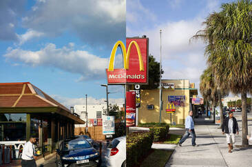
Diptychs are the comparison of 2 photos besides each other, creating either an explicit or implicit visual connection between the two photos. Many photographers use this technique to create a sequence of images, eg:
|
Jason Fulford & Tamara Shopsin - Creating a game of connections through diptychs.
This Equals That is a children book look-alike photobook that teaches the reader associative thinking and visual language, as well as colors, shapes, and numbers and how they are connected to one another. Taking Eisensteins thesis of 1+1=3 and creating a piece of art with it in mind |
John Maclean - Experimenting with perspective with diptychs.
Two and Two present pairs of photographs of subjects taken from two different viewpoints in fairly rapid succession. John highlights the inefficiency of a single still photograph in its ability to describe how the world looks and reminds us that we see the world with two eyes (and from slightly different angles) rather than one.
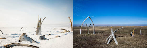
Katie Orlinsky - Playing with time and the change of seasons with diptychs.
Spring/Thaw juxtapose two images of the same scene photographed at different times of the year. Upon forcing those looking at the diptych to form a different opinion / interpretation of the location. Her aim was to highlight the effects of climate change through showing its eventual consequences of a variety of scenes.
Spring/Thaw juxtapose two images of the same scene photographed at different times of the year. Upon forcing those looking at the diptych to form a different opinion / interpretation of the location. Her aim was to highlight the effects of climate change through showing its eventual consequences of a variety of scenes.
SOLITuDE OF RAVENS
In the case of Masahisa Fukase, the subject of his gaze became the raven. For him, the “raven” was both a tangible creature and a fitting symbol of his own solitude |
|
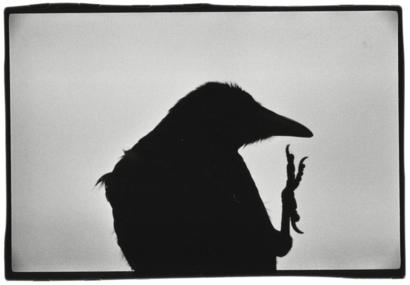
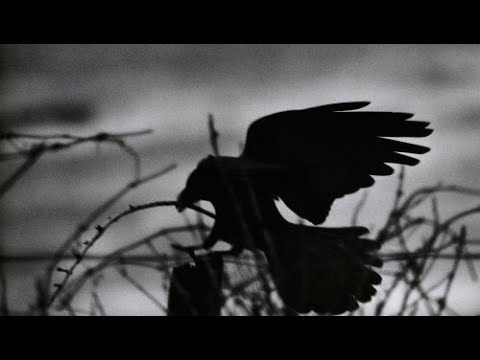
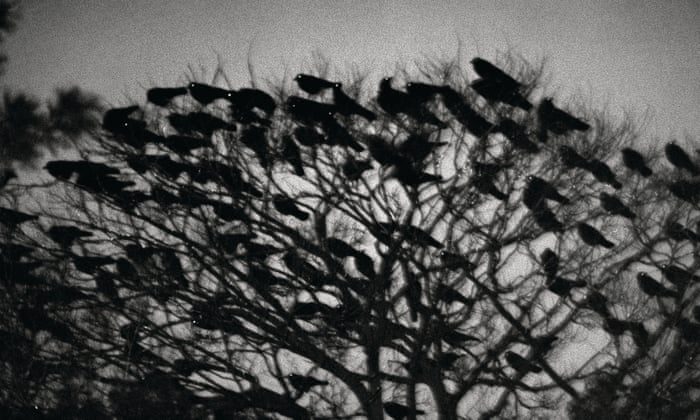
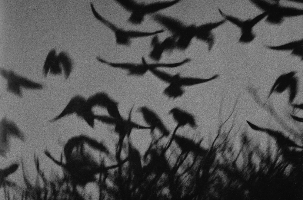
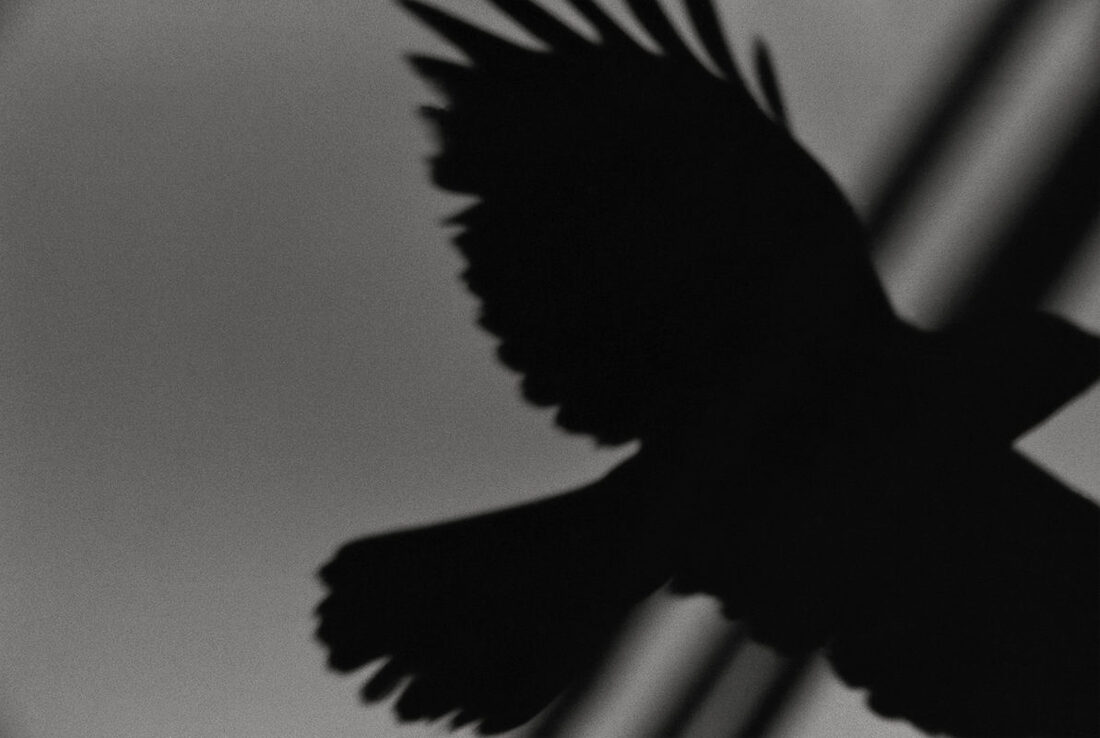

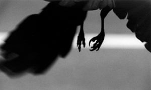
Masahisa Fukase’s Karasu (Ravens) was made between 1975 and 1982 , and published in 1991, due to the sudden depressing event of his wife Yōko Wanibe divorcing him. Fukase rose in popularity as a photographer in the aftermath of WWII and as such the series has, on occasion, been read as a commentary upon the despair surrounding Japan after their defeat. The visual theme throughout the series revolves around the human-like resemblance of the raven, it's anthropomorphic form. Dead or alive, the birds are interspersed from the beginning to the end of the book; Isolated individual birds reduced to shadow puppetry adjacent with the snow or the disrupted form of flocks that mimic the grain of the photographs themselves. Although partnered with other subjects such as blizzard streaked streets or a nude women, it is the recurring presence of the ravens that really illustrates an ominous and eerie atmosphere which surrounds the work.
Ravens are an ubiquitous feature of urban Japan (Re-occurring aspect) . Whereas in other countries, specifically western countries such as the UK, the image of the raven is seen as the harbinger of dark times.
Ravens are an ubiquitous feature of urban Japan (Re-occurring aspect) . Whereas in other countries, specifically western countries such as the UK, the image of the raven is seen as the harbinger of dark times.
Personally, what fascinated me about Fukase's The Solitude Of Ravens after researching about it is how you can really get a deep understanding on who he is as a person, especially his emotions and thought processes. The dark, grunge look of the photos exhibits an aura of isolation and self-ignominious(ness). Upon reading about his prevalence just after WWII, it made me take a second look at these pictures, and made me realise that this defeated feeling he once experienced carried along with him throughout his life, and despite a divorce being the stimulus for this piece, these emotions, thoughts and visions re-appeared and had an influence in this book aswell.
BEYOND HERE Is NOTHING
|
|
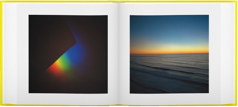
“It takes the viewer on a journey. Once you reach the end, you are not sure how to put it back together and the book becomes your own. You can decide to put the images the way you want. That’s an object that evolves with time” |
Laura El-Tantawy is a British/Egyptian documentary photographer, artful book maker & mentor. Born in Worcestershire, UK, she studied in Egypt, Saudi Arabia, the US & UK. In 2015 she released her first title “In the Shadow of the Pyramids”, a first-person account exploring memory & identity.
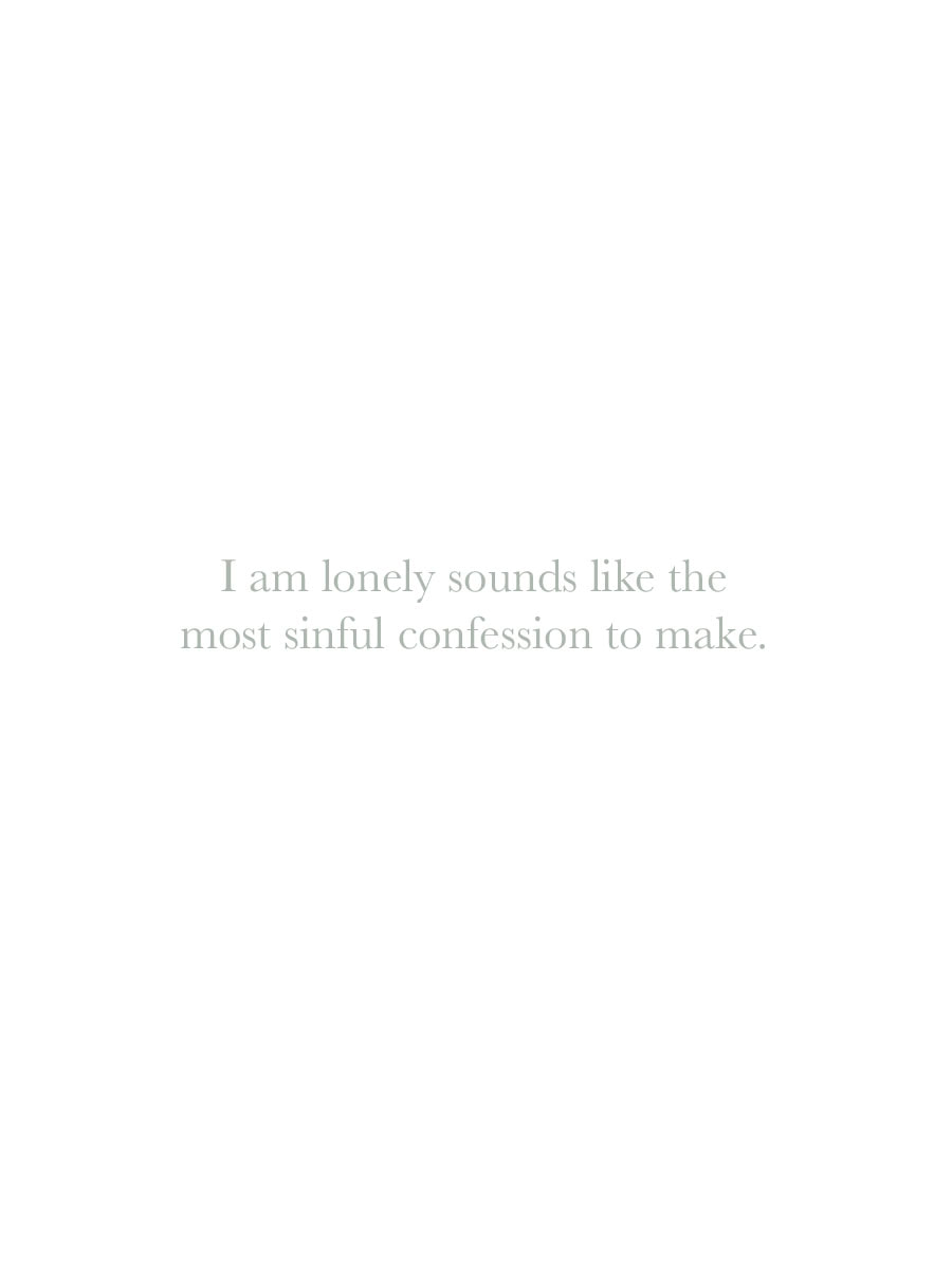
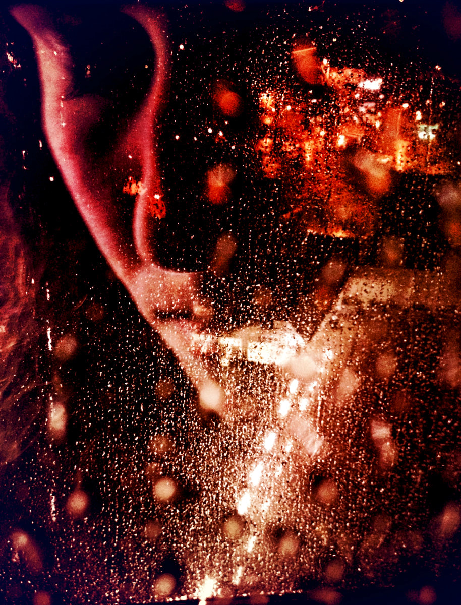
Beyond Here Is Nothing is photographic meditation. Some say meditation heightens the understanding and feeling for the sensuous events of daily existence, by seeing reality for as it is. Similarly, photography can produce the same reaction due to it's kinship with the intent of meditation, seeing life for what it is. Laura's focus for this book was the notion of home. To be home is to feel a strong connection to a land, a place of happiness and comfort. This body of work searches the boundaries of being, what it means to be something and exploring the unsettling feeling of rootlessness, the mental burden of loneliness and the constant search for belonging.
Beyond Here Is Nothing is photographic meditation. Some say meditation heightens the understanding and feeling for the sensuous events of daily existence, by seeing reality for as it is. Similarly, photography can produce the same reaction due to it's kinship with the intent of meditation, seeing life for what it is. Laura's focus for this book was the notion of home. To be home is to feel a strong connection to a land, a place of happiness and comfort. This body of work searches the boundaries of being, what it means to be something and exploring the unsettling feeling of rootlessness, the mental burden of loneliness and the constant search for belonging.
What I really enjoy and take deep interest in Laura El-Tantawy's Beyond Here Is Nothing is how abstract and strange the photos are, each individual photo has a unique aspect about it that tells a different story or protrudes a meaning. Partnered with the odd lines of text, instantly the book screams lonely, the title has a double entendre, one on hand it's telling me to not expect much from the book, or fathom an expectation. On the other hand, the title is self-deprecating, the individual taking this journey is beginning to fall into despair and truly believe that the place called 'home' doesn't exist for them and the phrase 'Beyond Here Is Nothing' applies to them.
THE ORIGIN OF THE PHOTOBOOK
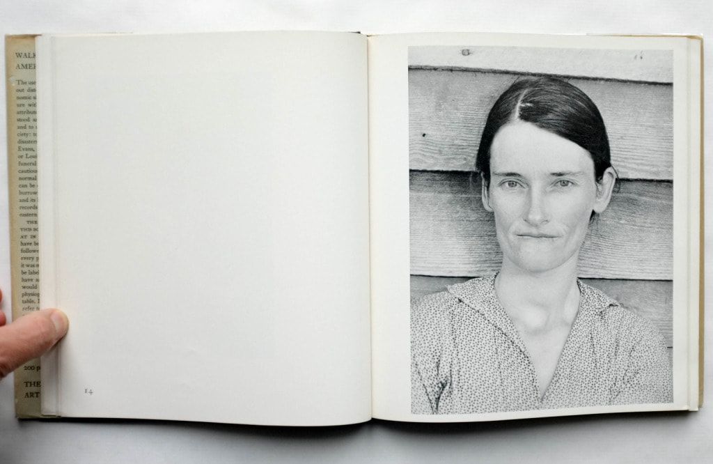
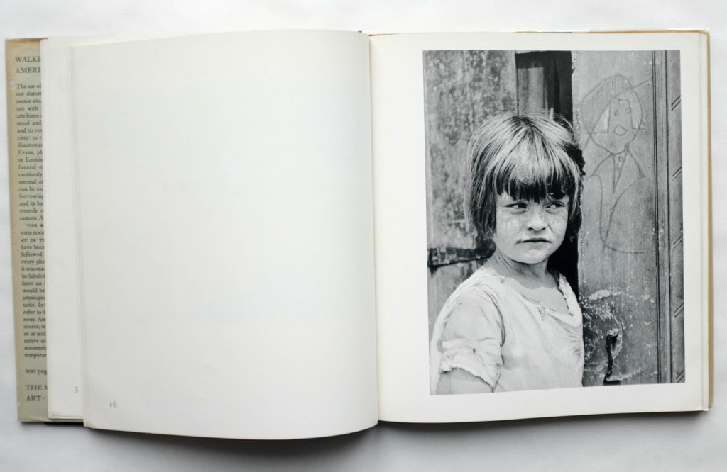
AMERICAN PHOToGRAPHS (1938)
|
|
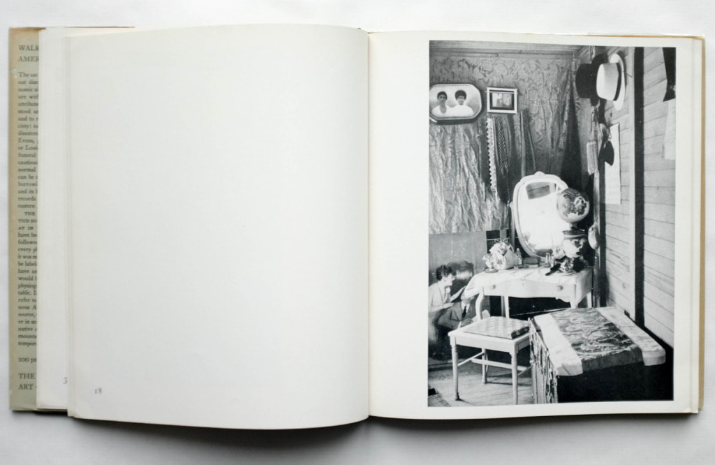
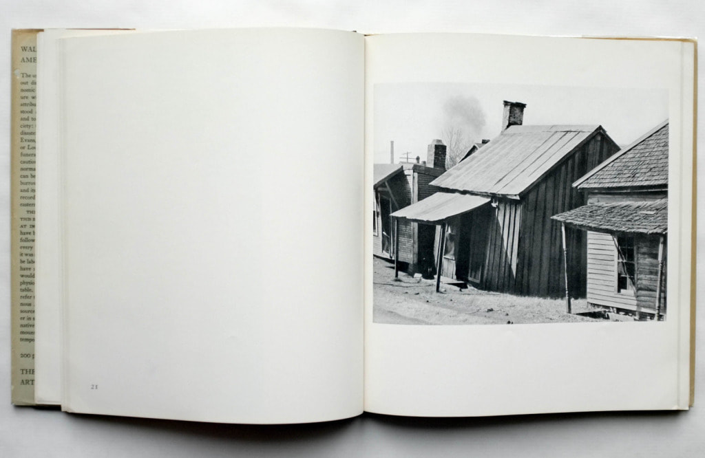
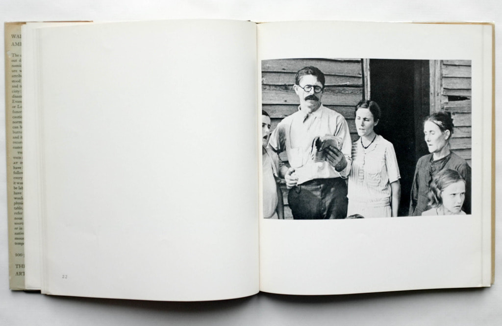
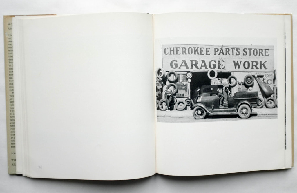
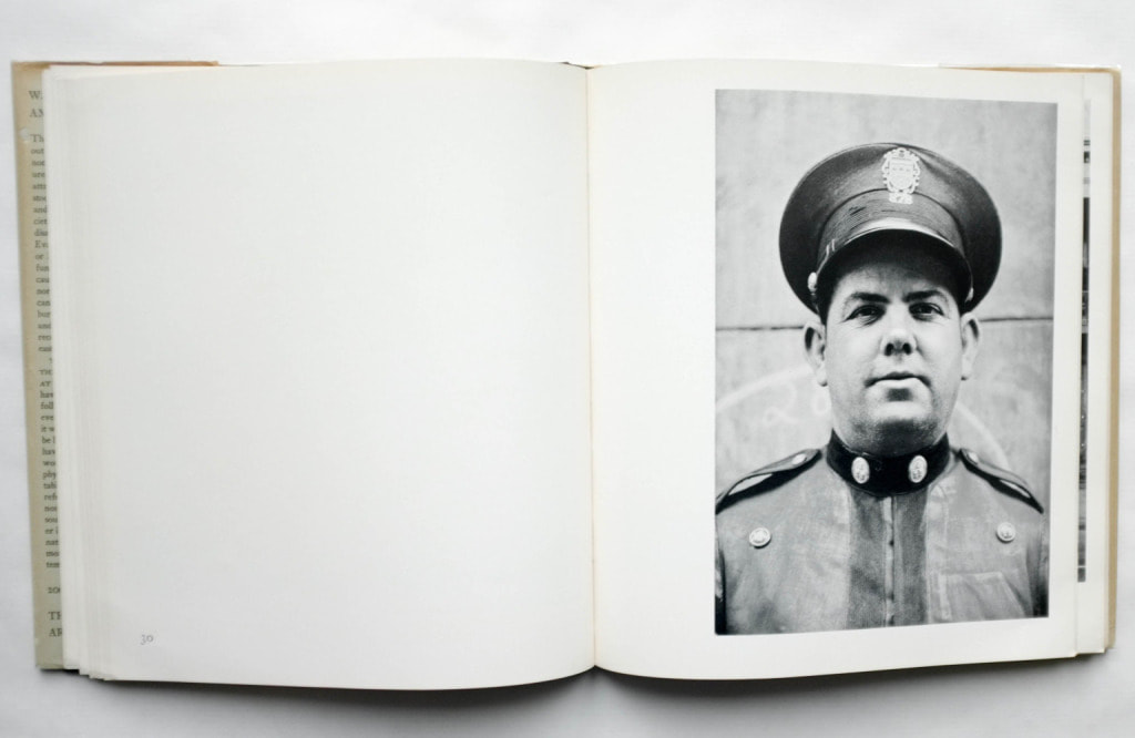
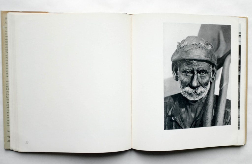
“Their proximity opens up the welcome association with what Evans did to define a picture of America on the eve of the Second World War — how that interaction with American popular culture would flower and change after the war in the work of these incredible American painters,” Published in 1938, Walker Evans' American Photographs remain a staple of classic photobooks, even being regarded as something to start the photobook movement. Evans started working for magazines and overall commissioned work, however his aversion only developed due to the definitive nature of the instructions given to him. When going out to accomplish these tasks, he often took photos of his own, deviating from what he was told and captured what he felt. Soon, this drove him to create a piece of individual work, specifically studying impoverished America. He adopted an objective standpoint and surveyed his surroundings, taking time to capture masterfully composed photographs that depict the inner dream, the reality hidden behind the prominent ideal of the 'American Dream'.
|
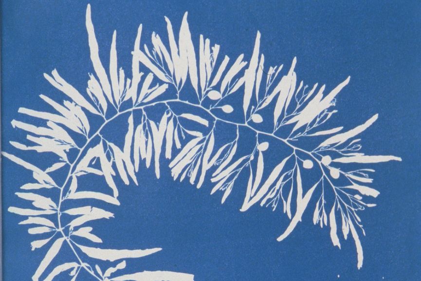
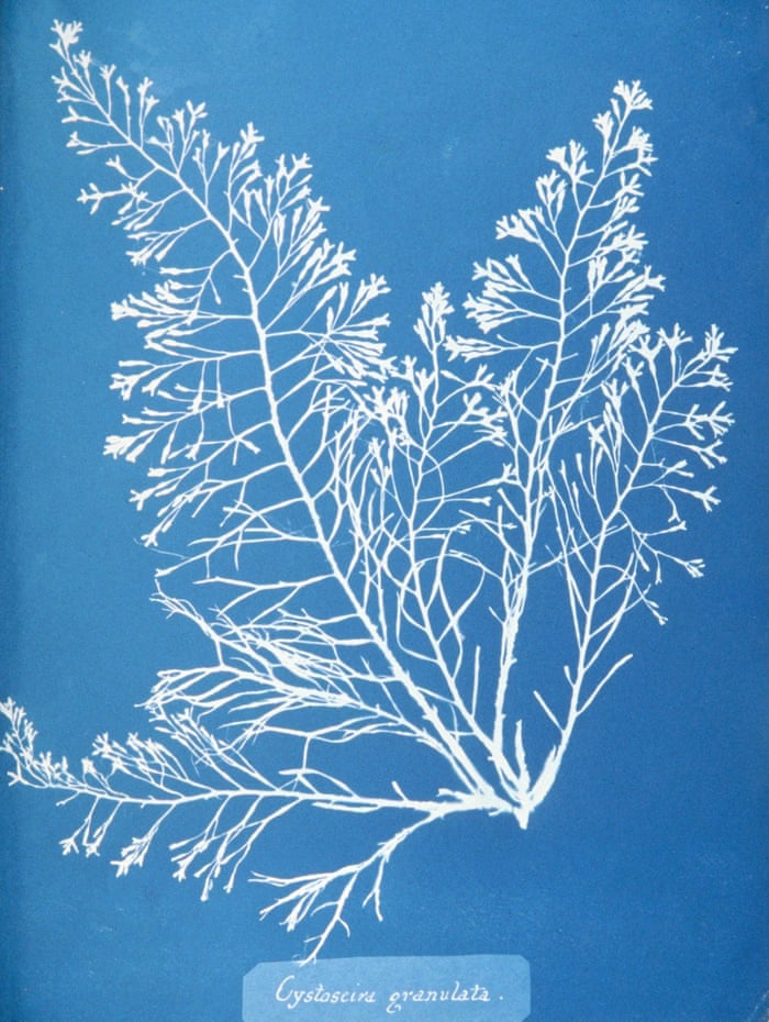
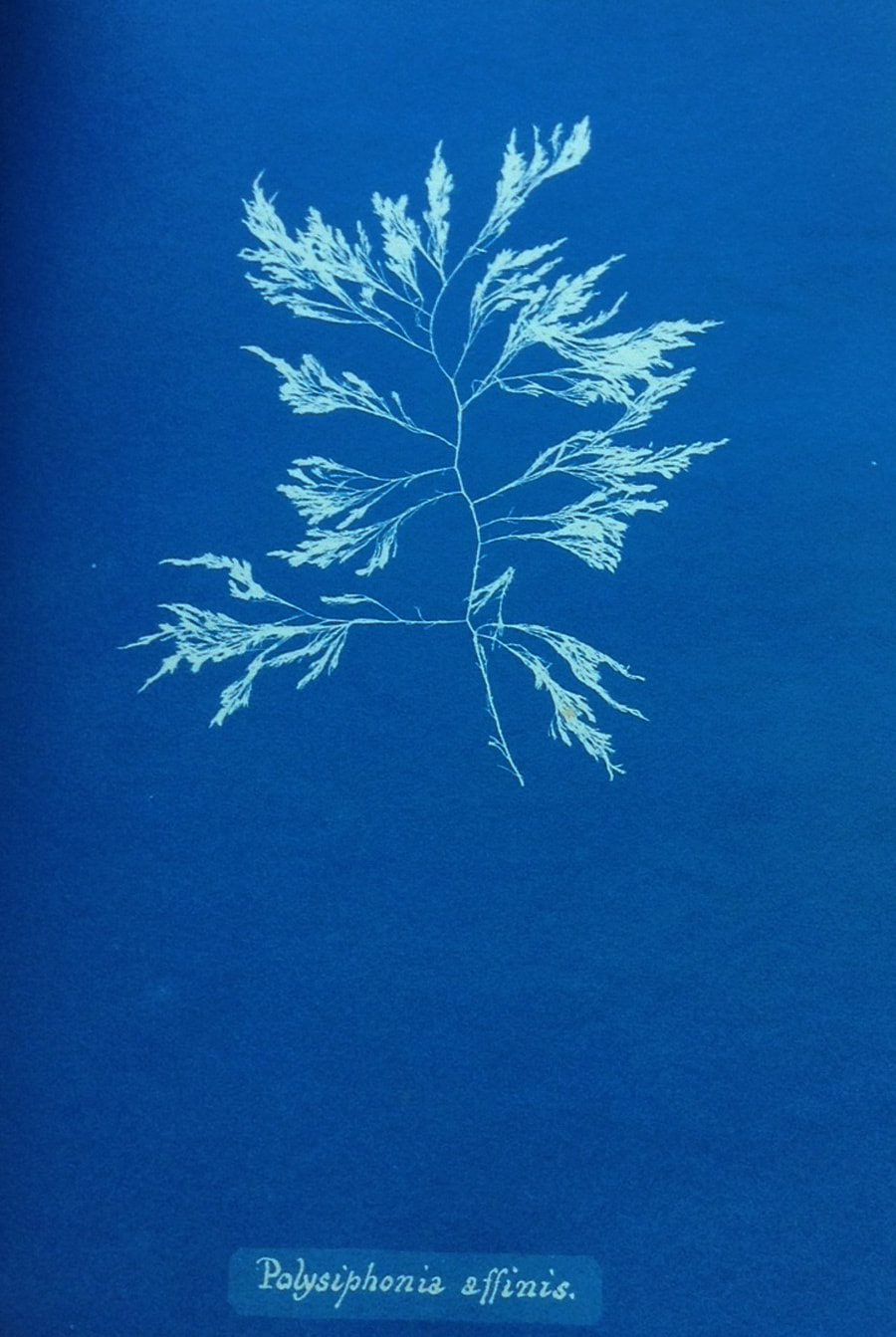
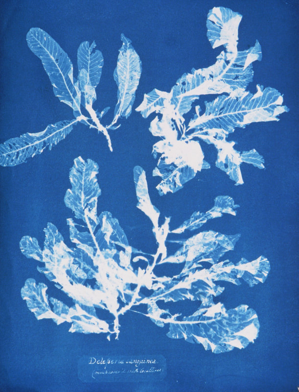
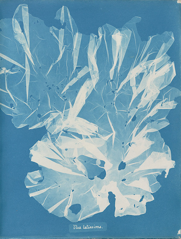
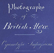
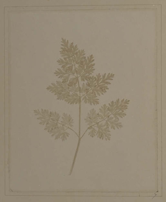
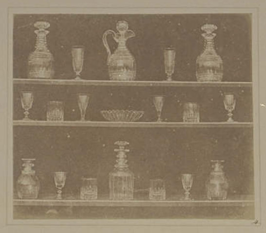
CYANOTYPES OF BRITISH ALGAE , 1843
|
|
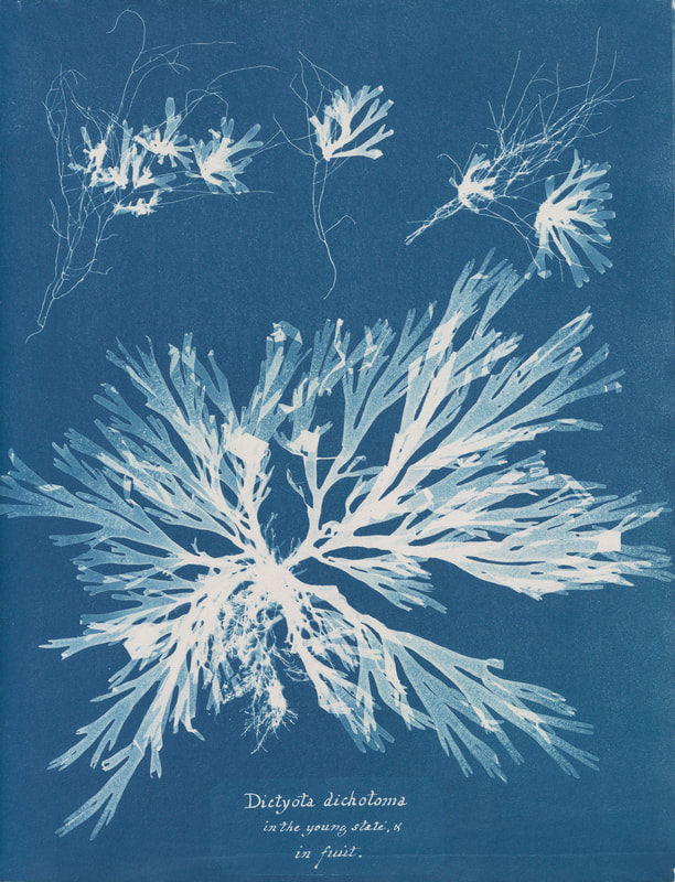
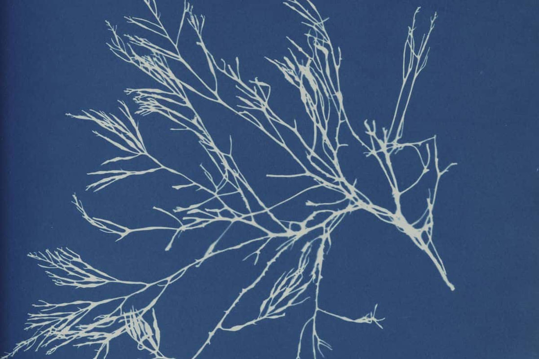
The difficulty of making accurate drawings of objects so minute as many of the Algae and Confervae has induced me to avail myself of Sir John Herschel’s beautiful process of Cyanotype, to obtain impressions of the plants themselves, which I have much pleasure in offering to my botanical friends. Anna Atkins was an English botanist and, some argue, the very first female photographer most noted for using photography in her books on various plants. Having grown up with her father John George Children who was a chemist, mineralogist, and zoologist, she was surrounded by science and also contributed to her father's work. Through her fathers connections, she grew to meet Henry Fox Talbot and Sir John Herschel, who both had a massive contribution to photography's history with Talbot, who invented a process of creating photographs on paper treated with salt and a solution of silver nitrate, and Herschel, the creator of Cyanotypes, creating photographs on paper using ferric ammonium citrate and potassium ferricyanide, then being exposed to sunlight and washed with water, all areas not covered by objects would appear a dark blue.
- This process became known as blueprinting, later used to reproduce architectural and engineering drawings. However, Atkins chose to use it for what is considered to be the first work with photographic illustrations, namely her Photographs of British Algae: Cyanotypes Impressions. |
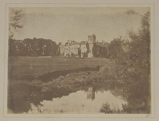
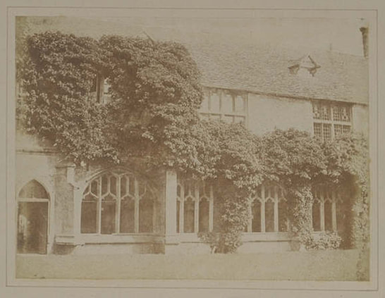
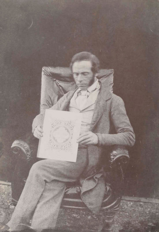
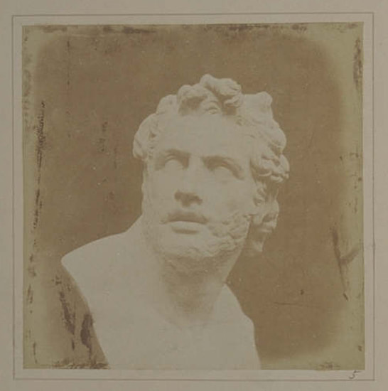
PENcIL OF NATURE , 1844
|
|
How charming it would be if it were possible to cause these natural images to imprint themselves durable and remain fixed upon the paper! And why should it not be possible? I asked myself. Talbot's hope for commercial exploitation of his work lay in the distribution of a large amount of photographic prints, the "principal advantage of negative-positive process over the daguerreotype."
- A daguerreotype is the first successful form of photography, a process created by Louis-Jacques-Mande Daguerre where a copper plate coated with silver iodide was exposed to light in a camera, then fumed with mercury vapour and made permanent by a solution of common salt, a permanent image would be formed. Talbot's first initial project was named Pencil of Nature, the first commercially published book illustrated with photographs. While trying, and largely failing, to sketch the views surrounding him with the aid a camera lucida, Fox Talbot's thoughts turned to his earlier experiences with his camera obscura. "and this led me to reflect on the inimitable beauty of the pictures of nature's painting which the glass lens of the Camera throws upon the paper in its focus - fairy pictures, creations of a moment, and destined as rapidly to fade away. It was during these thoughts that the idea occurred to me. how charming it would be if it were possible to cause these natural images to imprint themselves durably, and remain fixed upon the paper!" |
PHOTOZINES
|
Lewish Bush (2016) - A Model Continent is a documentation of a European theme park where all national landmarks are reproduced as scale models. This theme park is funded by the European Union as the park showcases an idealised continent (hence the name) where divided nations co-exist in peaceful harmony. |
Rik Moran (2015) - Flaneurism is a zine that documents a housing estate in poor shape. The photos take us on a journey around the Heygate Estate and showcases it's poor living conditions. With construction, graffiti and litter everywhere, those who look through this zine can imagine what it is like living there. |
PHOTOGRAPHS WITHOUT A PhOTO
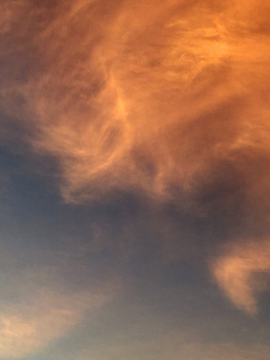
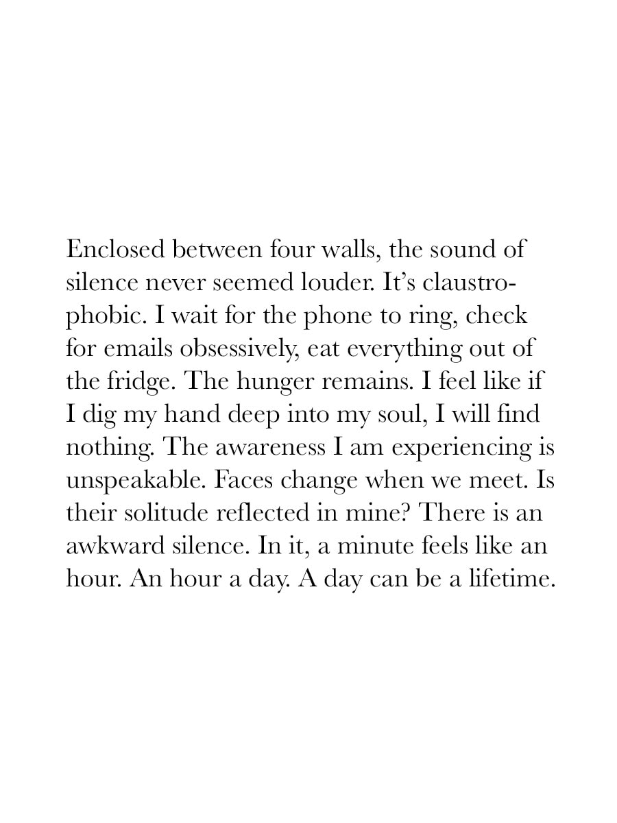
Looking at some extracts from a book called "Photographs Not Taken" I discovered a form of photography that is about making a photograph without taking an actual photo. The book entails many different sections from many different photographers outlining an experience they've had where they wanted to take a photo but didn't. One example of this was Deana Lawson. She wrote about a moment where her twin sister Dana, who had recently been told in a few months she'll be in a wheelchair, was trying to walk up 3 steps while holding onto shopping bags. What i deduced from her experience was that in that moment, Deana was looking at a reflection of herself and her own struggles and chose to help rather than run to get a camera because if she did so, she would be betraying herself, not trying to get better nor getting help, alongside it being morally wrong to not help her sister / herself.
After looking at these extracts, I had a go at writing my own experience:
Despite the time passing and sky being dyed a dark shade, the bustling city remained as busy as if it were midday. I walked down this busy street being pushed, shoved and being forced to move and stop whenever it suited others. Soon I came across an alley on the side of the street.
Small fairy lights travelled across the roof of the alley, flying between building to building shaping a corridor of light that lit up what once was a dim strip of concrete. The glowing colour variety of digital advertising plastered on every wall telling me what to see, what to do and, what to feel.
The mindless people surrounding me happily obliging to this fabricated corridor's invitation, strolling under the lights which painted a glow on their clothes, forgetting about their individuality and becoming senseless robots to what their surroundings are telling them to be.
I stood there, admiring the sight, analysing what it once was, is and will be yet my awe overwhelmed my rational thoughts and I turned and walked away, baring in mind what I just witnessed.
People still walk, but the surroundings tell why.
STRUCTURE TASK
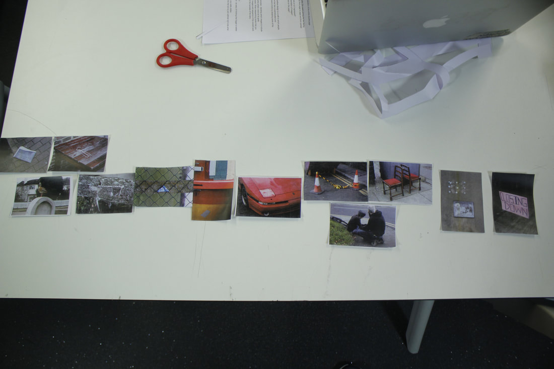
My first layout aimed to tell a story about a boy, involved in a car crash who unfortunately passed away. The sequence starts grouping images which have the focus on one subject, normally demonstrating and protruding a lively atmosphere. However what precedes this is multiple images that portrays a pathway in which is meant to represent the car travelling, hence why the car is on display directly after this collective.
|
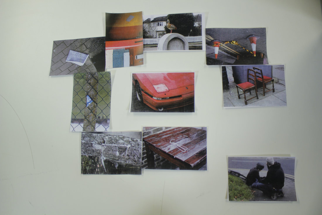
My second layout's intention was to portray a sense of movements and travel via conjoining lines and shapes. I connected photos and put them in a specific structure depending on shapes and lines within each photo. Each adjacent photo have a line running through them ending up at a photo where this trend cannot be continued.
|
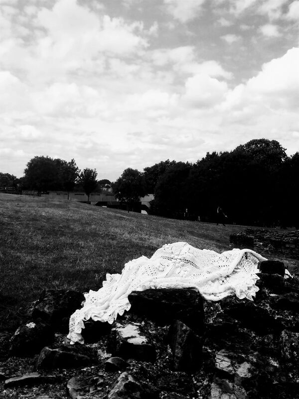
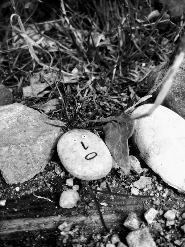
MY DRAFT PHOTOBOOK
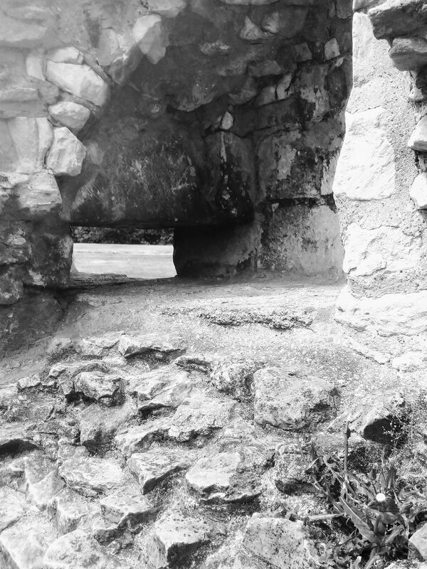
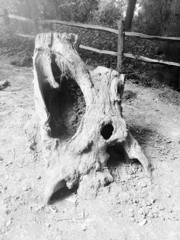
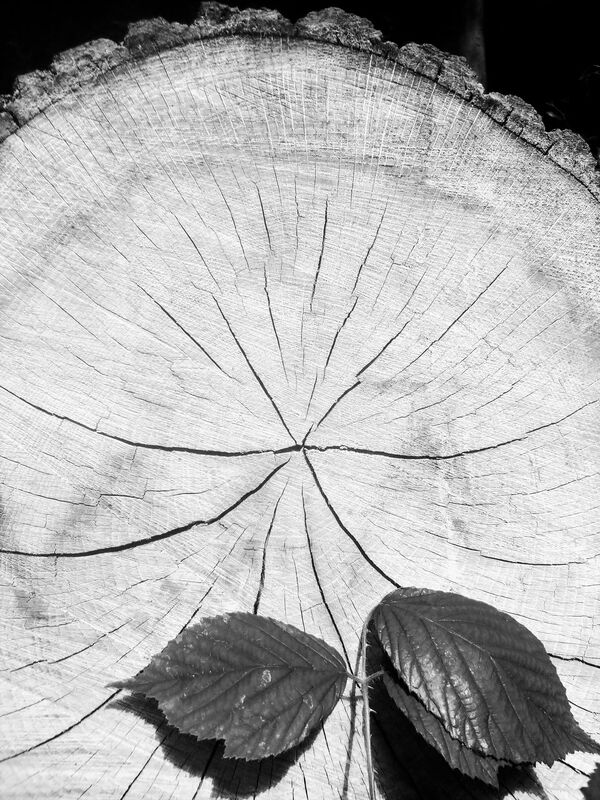
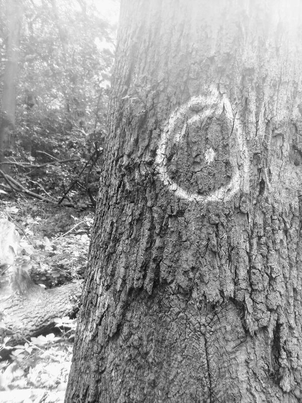
Evolution. A truthful conclusion to our races' past? Or just a mere fabrication aiming to explain our incomprehensible history? Scientists and those who do not believe in a greater being accept this 'proof' to be the truth of their existence. The human race to this day have retained an animalistic nature, stemming from unprovoked violence like acts of war and our innate characteristics that are crucial for our survival, eat, mate and sleep. Mother Nature forced the creatures from our past to adapt and overcome its trials, causing it to evolve into a greater being that could live in such a demanding and dangerous world, however, we created a greater force 'society' which now imposes pressure on us to adapt and overcome technological advances, culture clashes and personality stigmas.
- My book is about the journey of human race and how it's kept some of the traits from its 4 legged ancestors both biologically and subconsciously.
- My book is about the journey of human race and how it's kept some of the traits from its 4 legged ancestors both biologically and subconsciously.
|
|
|
THE FINAL PHOTOBOOK
In my initial idea, I intended to create 2 books, one that appeared professionally printed and the other as a scrap book, however I eventually did not use that idea as I did not think it was necessary to portray my concept effectively, if anything the addition of a second book would hide the intended affect and confuse whoever is in possession of them. As a result, I determined that a single professionally printed perfectly bound book would be the most adequate model for my photo-book as the information that it contains is factual and scientifically sound, the book pages are professionally created generating respectability and upholding a level of professionalism around them thus, having a ragged poorly bounded book, would contradict the pages purpose, which is to inform and preserve genuineness.
I decided to have an unconditional layout to the pages' order as due to the concept, the layout of the pages would have no significance towards the meaning of the book and how it's conveyed. Each individual page tells an individual story, which ultimately comes together to make the bigger picture. nonetheless, the order of the stories do not matter. Each page is bonded together as they fall under the same concept, yet one page does not have a direct link with another.
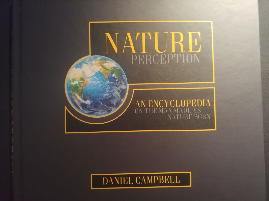
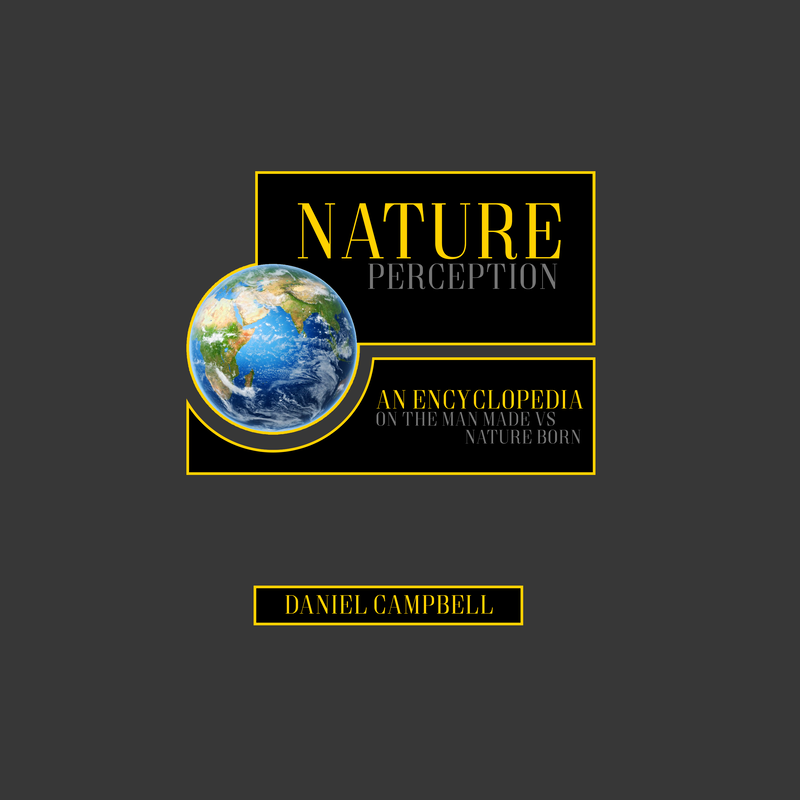
I wanted the front and back cover to maintain and portray the level of professionalism I intend the photo-book to exhibit. I looked up other encyclopedia's and used them as inspiration for my cover. I learnt that the covers are very simplistic with minimal visual stimuli, many encyclopedias I found did not incorporate pictures into their front design although some have. I had my book in a landscape orientation with it's measurements being roughly 24.5cm x 21.5cm, therefore I did not want front and back cover to fill up the entire page as it would appear stretched and disproportionate. I decided to include a picture of the earth as a part of my front cover since my book is visually demanding, so having a picture on the front cover implies that very fact. I decided to use premium matte paper for the book instead of glossy paper as I did not want the gloss effect on the photos as I think it makes photos seem less legit and real, furthermore it would bring more attention to the photos more than the analogy between the pages.
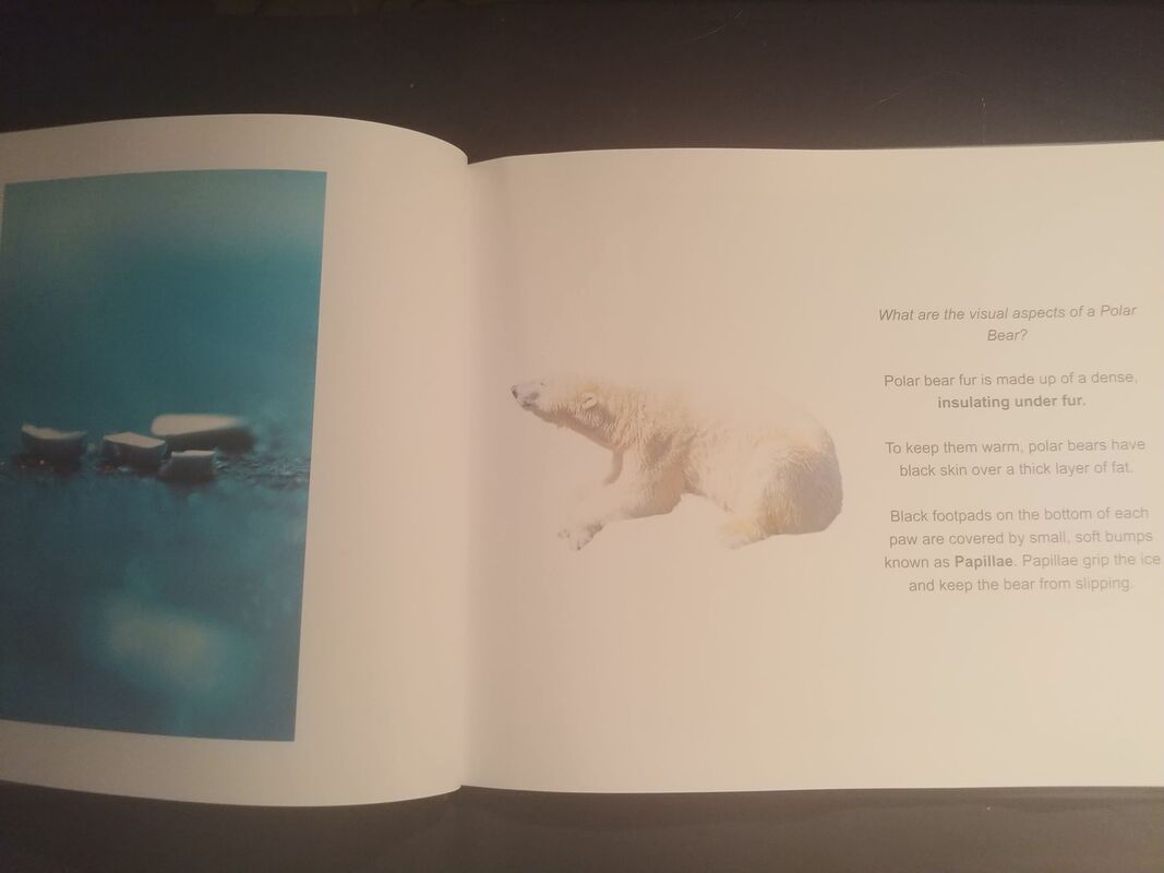
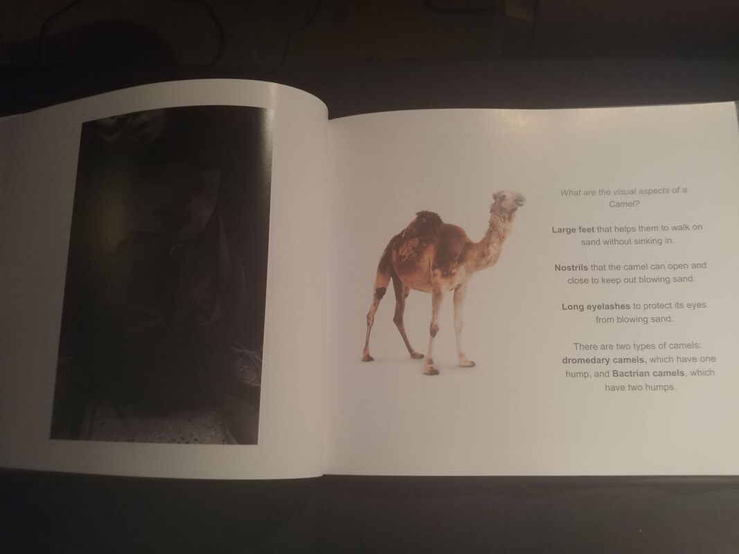
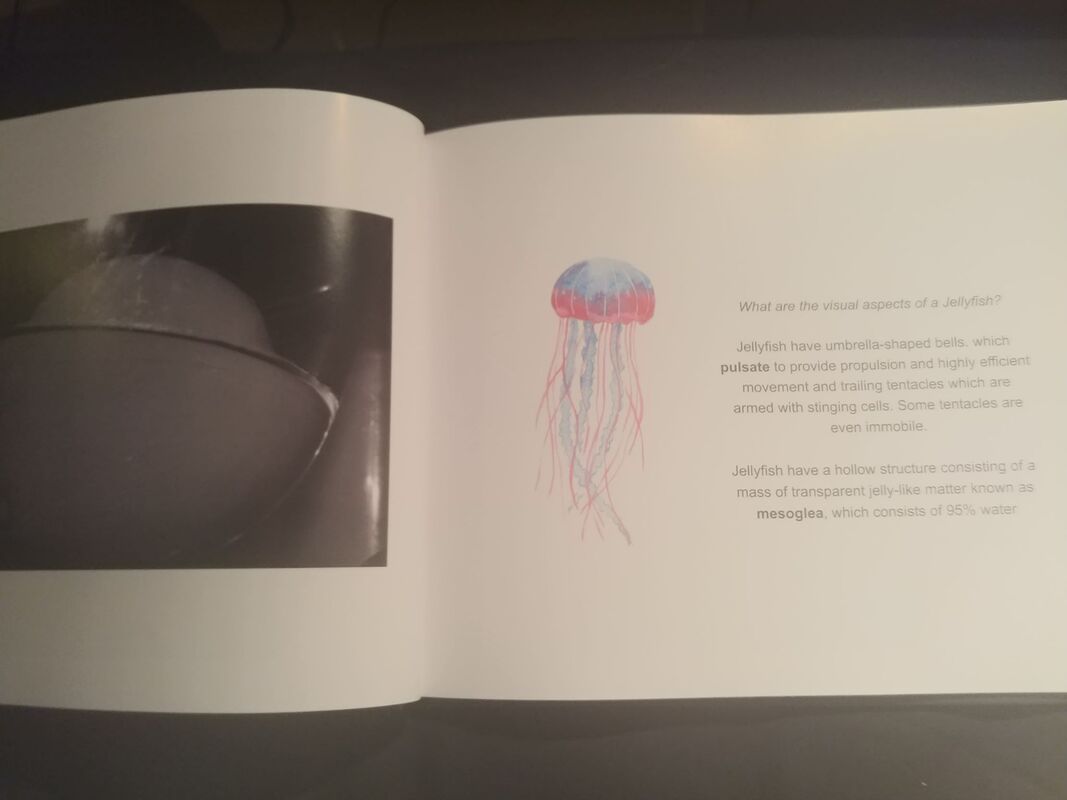
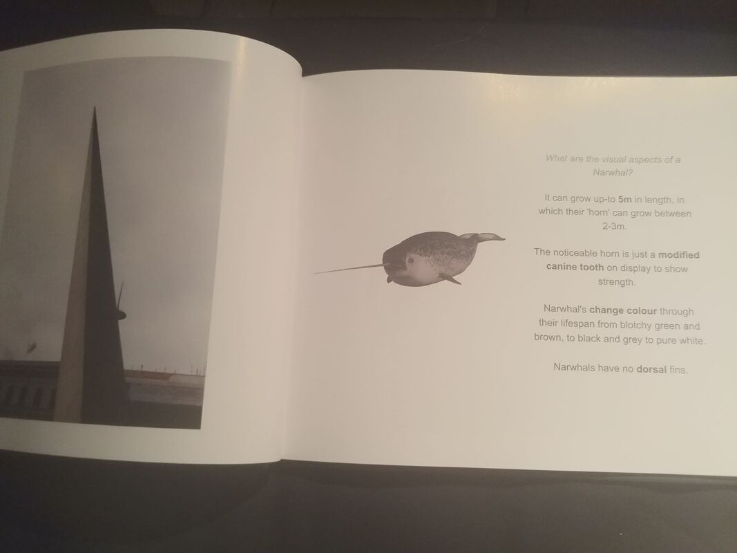
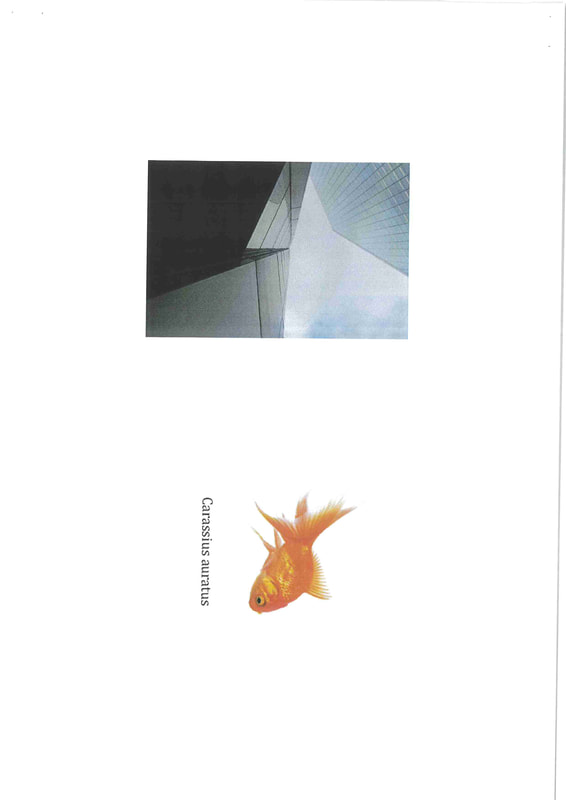
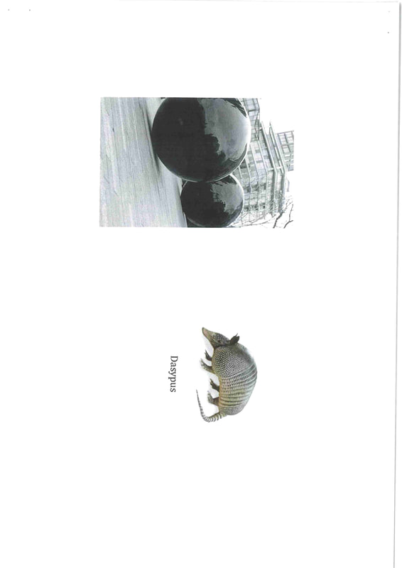
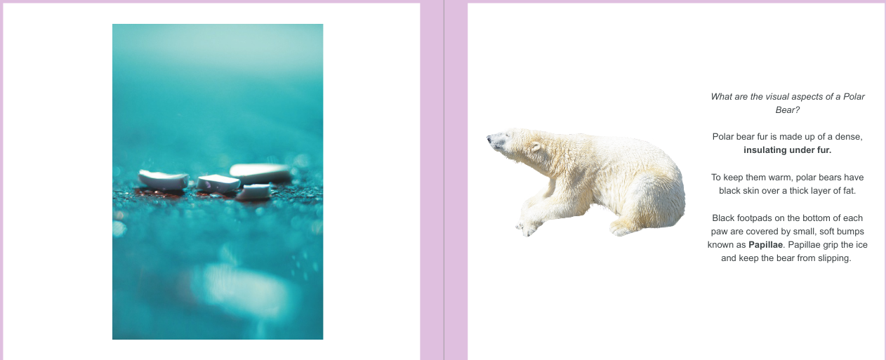
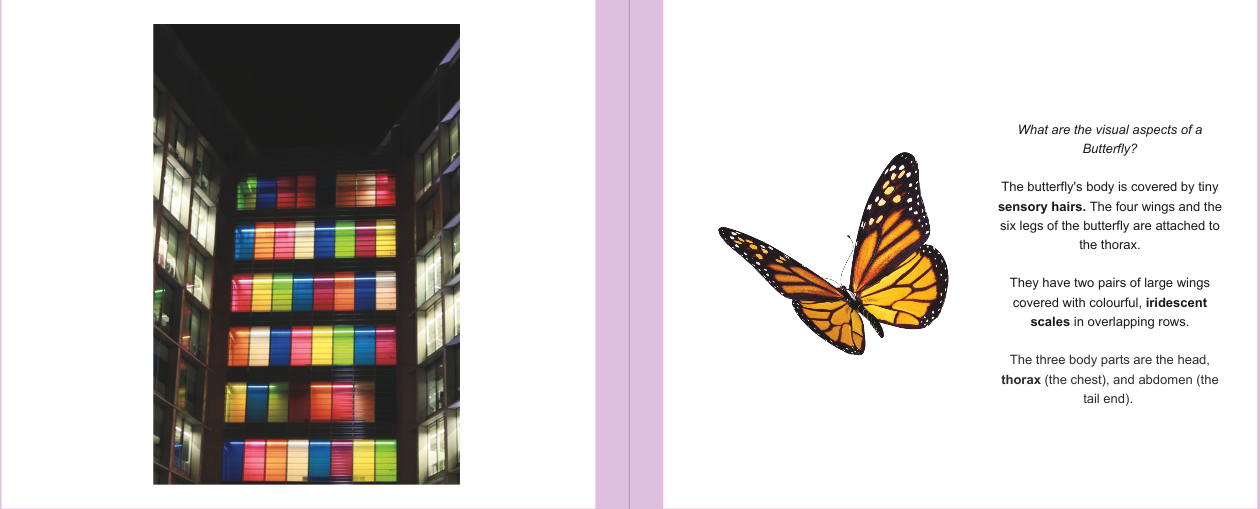
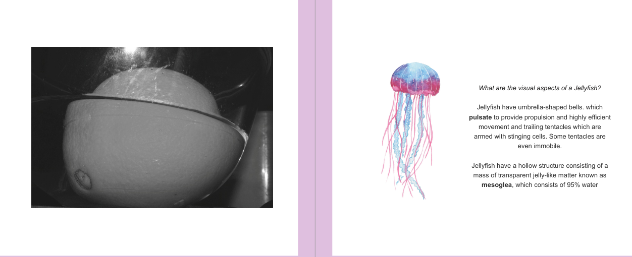
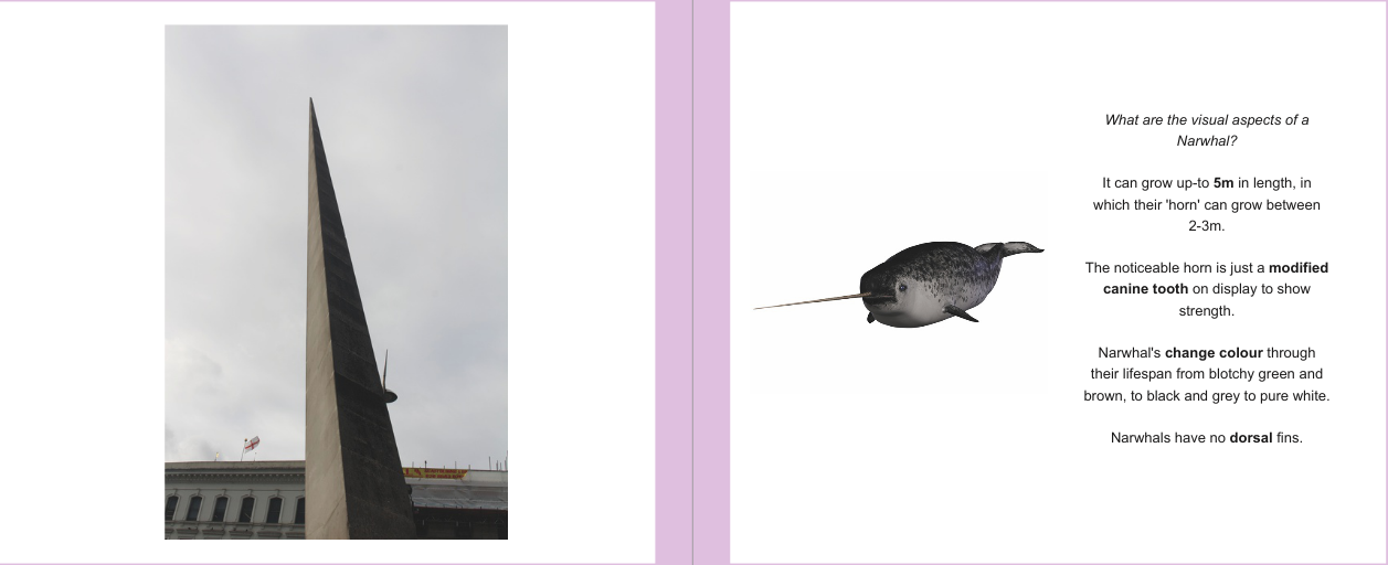
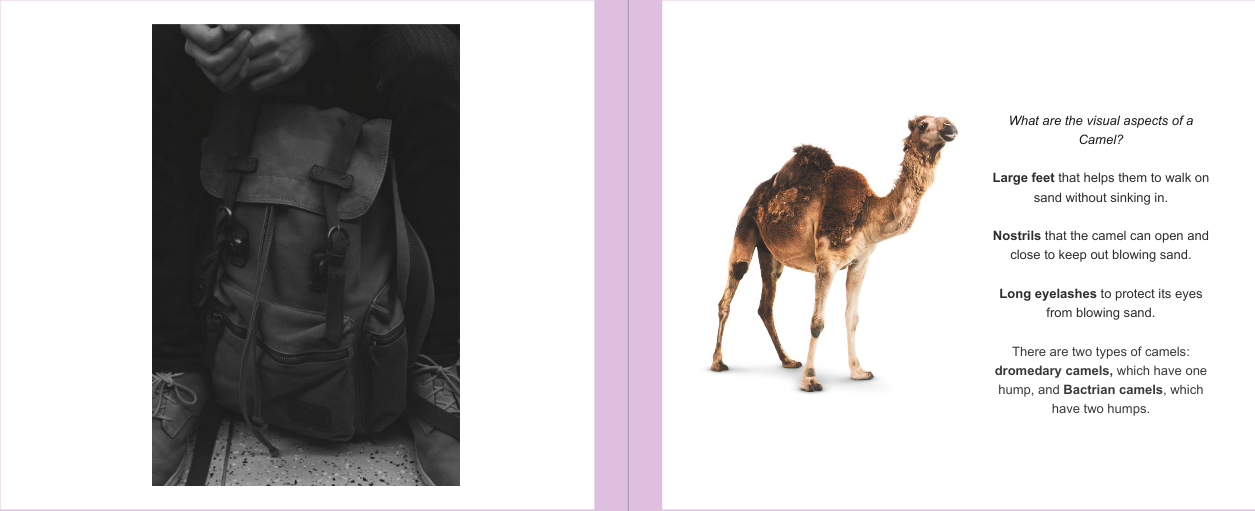
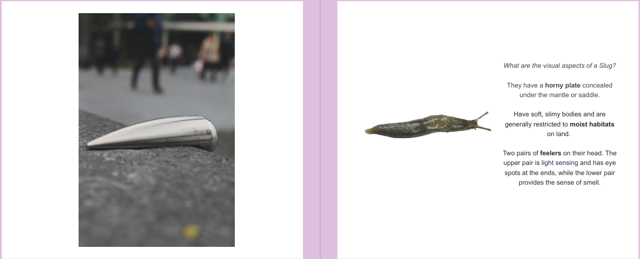
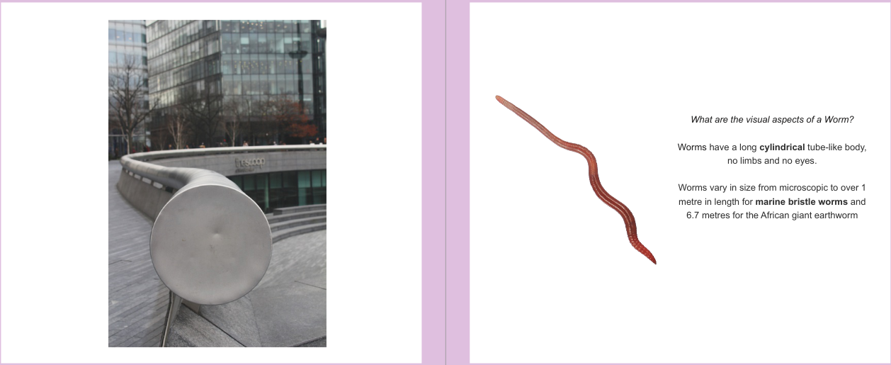
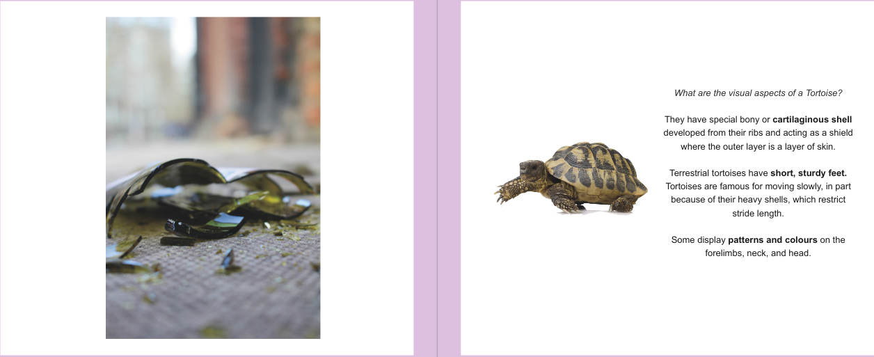
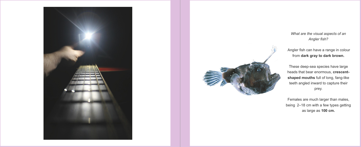
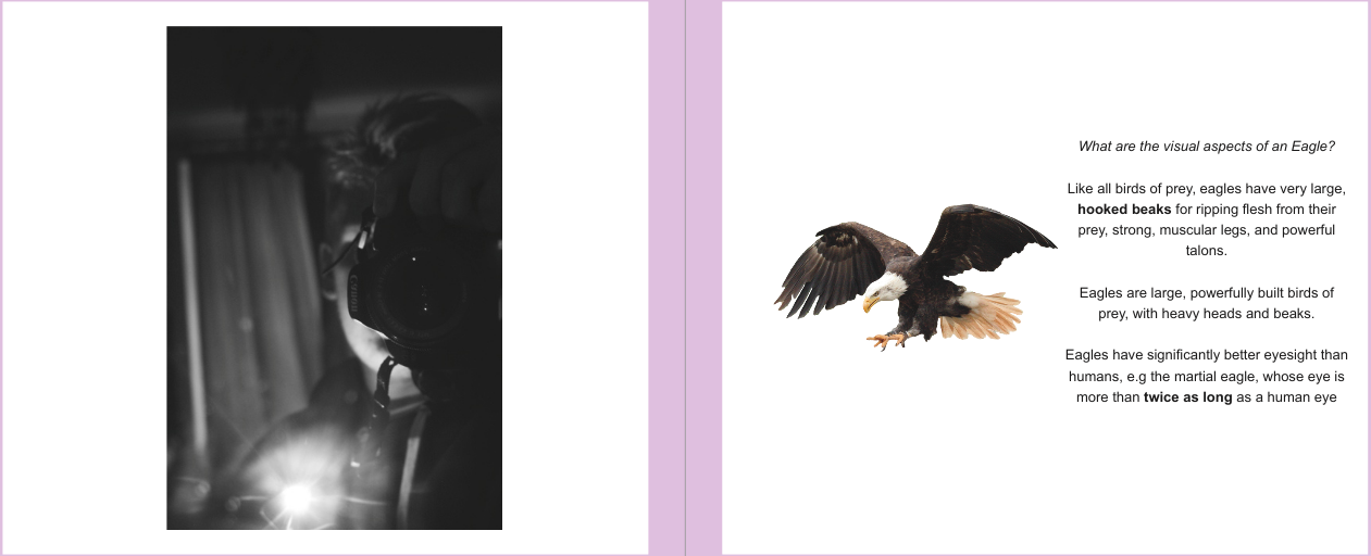
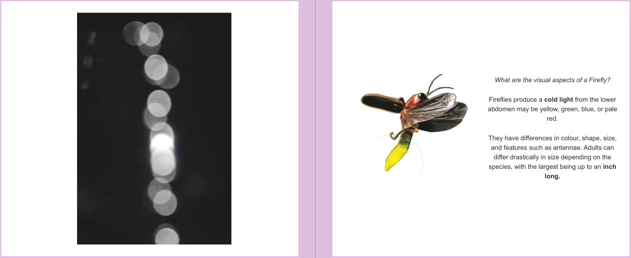
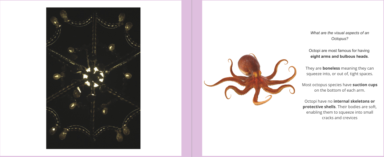
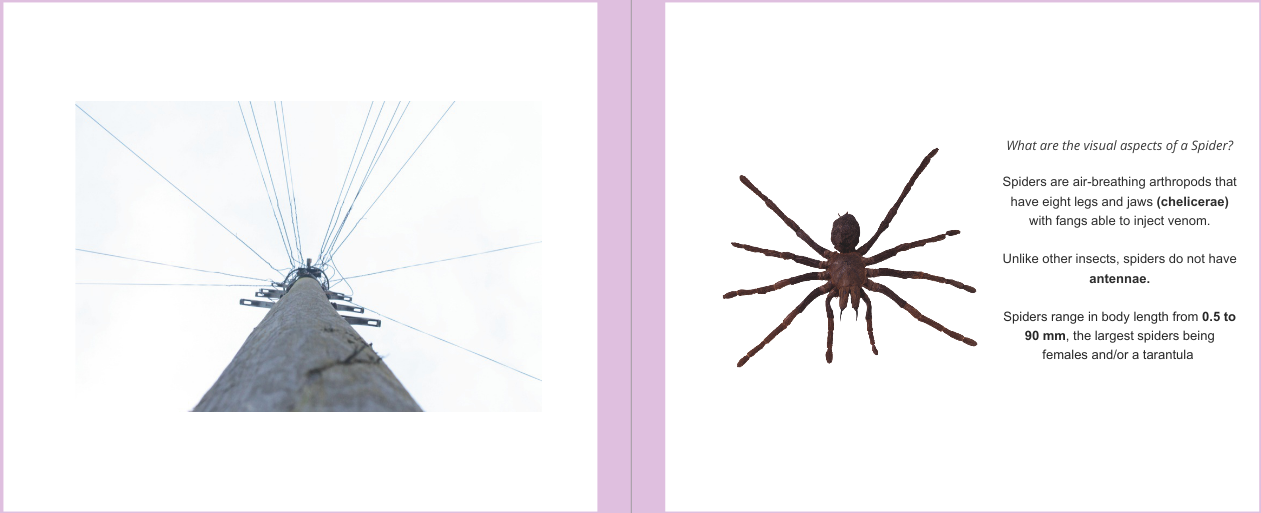
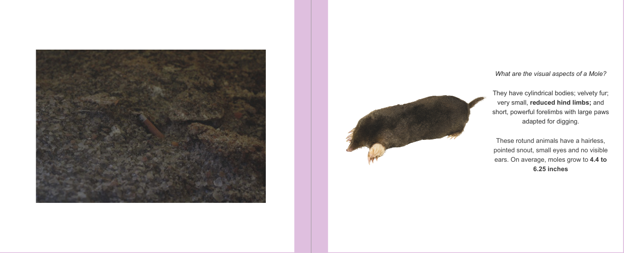
Binding, paper, covers and the layout of my book have impacted the total effectiveness of the book as they are all in accordance with each other, they all individually express a form of appropriateness towards the concept of the book. Both the cover and the binding set a first impression that the book should be perceived as a canonical book, and the paper and layout of the book conveys the concept effectively as it is easy for the viewer to understand what it is they are meant to be attentive towards, and that being how each photo relates to the animal adjacent. In simpler terms, the books exterior sets the mood while the interior demonstrates the concept.
Overall, I believe my project to be a success and I am satisfied with the result that was produced. Upon asking friends and family members what they think the purpose behind the book is, they all responded with similar answers, with those being related to the idea of 'The comparison between animals and humans', accordingly I am forced to acknowledge the effectiveness of my photo-book. In the event that I would have more resources to complete the task again, I would supply 2 books rather than a single one, with the main book containing just the animal and photo with the other book containing information on each animal alongside reports of where and when I took each photo, this would allow the main book to have more space surrounding the animal, as I believe it to look slightly cramped on those pages, and provide extra details about each partnership so the viewer has greater understanding and can draw out more conclusions. This is an aspect I found challenging doing this project, figuring out which photo matched what animal. When going out on photo-shoots, I would not formulate a plan nor have a list of animals that I would like to match with, rather I snapped what I perceived to be as interesting and brainstormed at a later date what I could compare them to, being either a subtle or obvious connection. I started to realise throughout this project how important a concept is, without meaning a book does not have form. I consistently found myself thinking 'Does this link to my concept?' or 'How can this portray the meaning my book?', despite me previously knowing that you should have a concept, this project just further pushes that narrative and it's significance towards the success of the journey and final product.
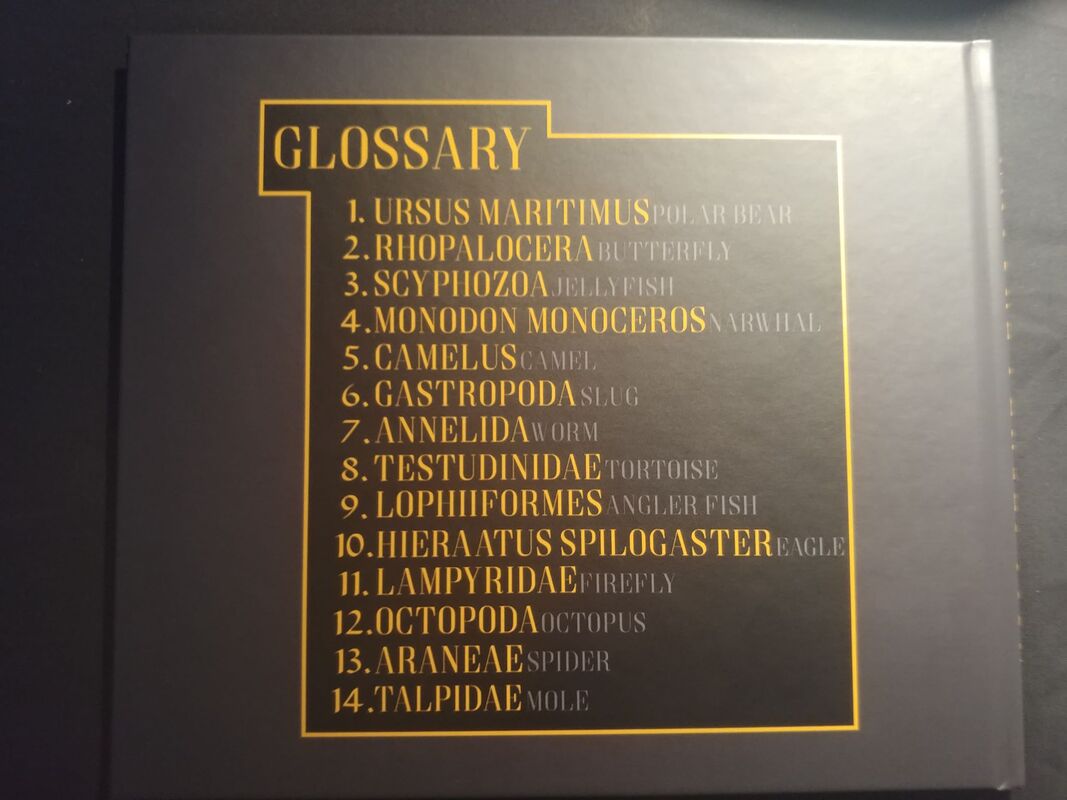
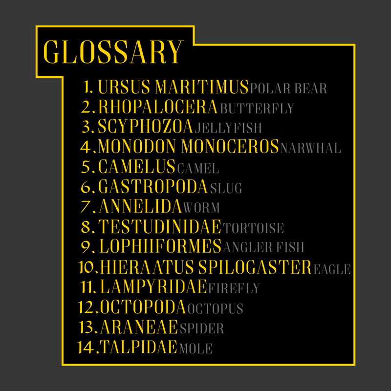
Overall, the aspects I'm most pleased about regarding the project is either the unique concept that I created or the design of the back and front cover. I really like how the covers look and the glossary about the animals fits the theme really well and contributes to the visual aspect of the cover.
I decided to have an unconditional layout to the pages' order as due to the concept, the layout of the pages would have no significance towards the meaning of the book and how it's conveyed. Each individual page tells an individual story, which ultimately comes together to make the bigger picture. nonetheless, the order of the stories do not matter. Each page is bonded together as they fall under the same concept, yet one page does not have a direct link with another.
I wanted the front and back cover to maintain and portray the level of professionalism I intend the photo-book to exhibit. I looked up other encyclopedia's and used them as inspiration for my cover. I learnt that the covers are very simplistic with minimal visual stimuli, many encyclopedias I found did not incorporate pictures into their front design although some have. I had my book in a landscape orientation with it's measurements being roughly 24.5cm x 21.5cm, therefore I did not want front and back cover to fill up the entire page as it would appear stretched and disproportionate. I decided to include a picture of the earth as a part of my front cover since my book is visually demanding, so having a picture on the front cover implies that very fact. I decided to use premium matte paper for the book instead of glossy paper as I did not want the gloss effect on the photos as I think it makes photos seem less legit and real, furthermore it would bring more attention to the photos more than the analogy between the pages.
Binding, paper, covers and the layout of my book have impacted the total effectiveness of the book as they are all in accordance with each other, they all individually express a form of appropriateness towards the concept of the book. Both the cover and the binding set a first impression that the book should be perceived as a canonical book, and the paper and layout of the book conveys the concept effectively as it is easy for the viewer to understand what it is they are meant to be attentive towards, and that being how each photo relates to the animal adjacent. In simpler terms, the books exterior sets the mood while the interior demonstrates the concept.
Overall, I believe my project to be a success and I am satisfied with the result that was produced. Upon asking friends and family members what they think the purpose behind the book is, they all responded with similar answers, with those being related to the idea of 'The comparison between animals and humans', accordingly I am forced to acknowledge the effectiveness of my photo-book. In the event that I would have more resources to complete the task again, I would supply 2 books rather than a single one, with the main book containing just the animal and photo with the other book containing information on each animal alongside reports of where and when I took each photo, this would allow the main book to have more space surrounding the animal, as I believe it to look slightly cramped on those pages, and provide extra details about each partnership so the viewer has greater understanding and can draw out more conclusions. This is an aspect I found challenging doing this project, figuring out which photo matched what animal. When going out on photo-shoots, I would not formulate a plan nor have a list of animals that I would like to match with, rather I snapped what I perceived to be as interesting and brainstormed at a later date what I could compare them to, being either a subtle or obvious connection. I started to realise throughout this project how important a concept is, without meaning a book does not have form. I consistently found myself thinking 'Does this link to my concept?' or 'How can this portray the meaning my book?', despite me previously knowing that you should have a concept, this project just further pushes that narrative and it's significance towards the success of the journey and final product.
Overall, the aspects I'm most pleased about regarding the project is either the unique concept that I created or the design of the back and front cover. I really like how the covers look and the glossary about the animals fits the theme really well and contributes to the visual aspect of the cover.